It’s a Very Very… Mad World
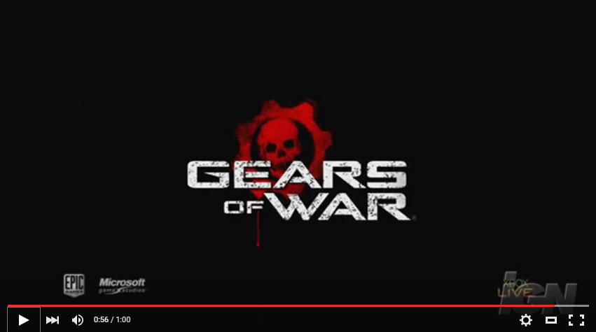
If you were aware of videogames back in 2006, you definitely encountered this ad for the upcoming Xbox360 blockbuster “Gears Of War”:
All around me are familiar faces, worn out places, worn out faces…
Hide my head I want to drown my sorrow, no tomorrow… no tomorrow…
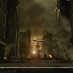
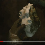
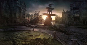
This was a gutsy commercial. I still marvel at it today, actually, and revisit it from time to time. A fantastic example of the use of dissonance – videogames are known to be frenetic, violent and aggressive (at least, the shooters, be it first- or third-person), and to open on a melancholy piano and downbeat lyrics about familiar faces and worn out places… overlaid on top of a ruined city and a smashed cherub’s head – it really had the potential to backfire. History proved otherwise, obviously… it went exceedingly viral, and I think it holds up as one of the most memorable videogame adverts ever released.
I’m not privy to the decision making that led to it, but on the surface, it would have made much more sense to go the Halo 2 route from a few years earlier: Get some alt-rockers like Breaking Benjamin to record some aggressive and noisy rock that would seem much more appropriate for the genre: “Blow Me Away” on YouTube
But they didn’t. They actually dug deeper into the ethos of the game: “Destroyed Beauty”. It was in all the interviews and hype leading up to the game…
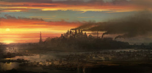
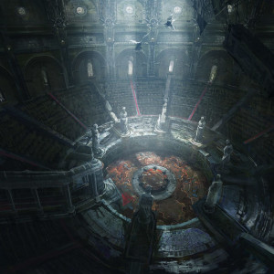
They took a classically-architectured world, “Sera”, that comprised of a lot of Byzantine building designs, coupled with modern-day tech… and trashed the crap out of it.
So really, that WAS Gears of War in a very real sense. I think the marketing department actually did their job with that one, because everything about Gears of War was melancholy. I played it. It coupled adrenaline-pumping violence with a destroyed world that just made you sad, even when you marveled at the design of it all.
(they’d later acknowledge that they may have pushed the colour palette a bit into the dreary side with its earned nickname “Greys Of War”)
So, yeah, if Marketing had been asleep at the wheel and had not been paying attention to what the game actually was, they probably would have gone the Blow Me Away route. But, that would have been a really shallow assessment of what the game actually was, and I got no sense that these guys were anything but on top of their game when setting things up to launch it.
Personally, I wasn’t familiar with Donnie Darko when the trailer launched, so I had no idea that Mad World had been lifted from that soundtrack. I knew it as an old Tears For Fears song, but I thought this spare, melancholy piano-driven track had been recorded specifically for the Gears Of War trailer. Even though it wasn’t, though, it might as well had been.
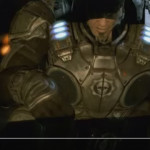
The tension in the ad builds as Marcus ends up on the run from enemies that are closing in, until he dives into a warehouse or something. Safe? Hardly…
And I find it kinda funny, I find it kinda sad…
the dreams in which I’m dying are the best I’ve ever had.
So here’s where they start delivering on the violence promised by the title, but even then, it feels more like an elegy, a lament for the dead.
I find it hard to tell you. I find it hard to take.
When people run in circles it’s a very very… mad world…
You don’t hear the gunshots. You don’t hear the monstrous roar. You’re disconnected from it in a sensory way, aside from the music and words, so you’re still feeling the melancholy, and in fact, before the screen goes black, you watch Marcus being dwarfed by a seemingly unkillable enemy… setting up the promise of the game itself… a sad, epic quest in which the odds are ever against you and death is far more assured than victory…
Mad world…
