A Campaign Takes Repetition Coupled With Variety
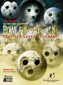
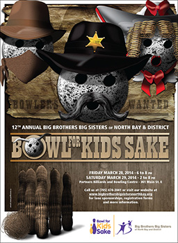
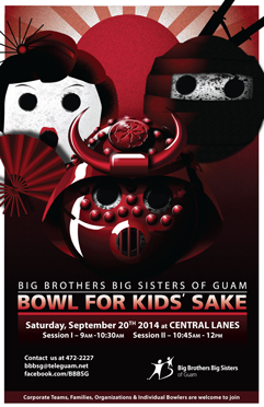
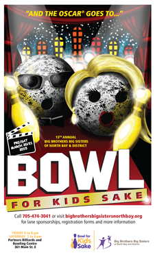
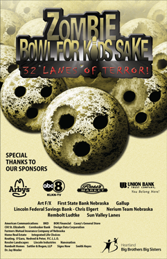
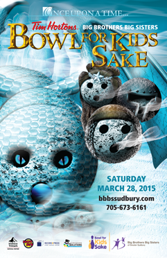
I’ve been working for years with the Big Brothers Big Sisters agency in Greater Sudbury. The one one big fundraiser I always help them with is the Bowl For Kids Sake. In recent years, we’ve been utilizing my anthropomorphized bowling balls:
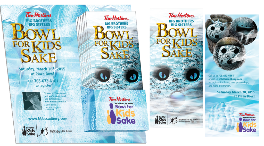
Now, there are two components to their fundraising and marketing efforts during these campaigns. Offline, and online. Offline sees a series of collaterals created:
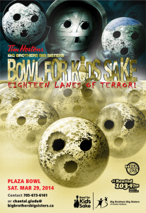
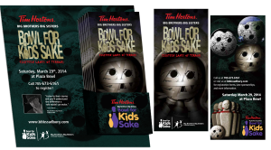
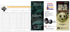
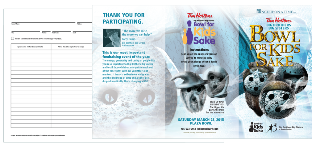
Main poster – up at Tim Hortons in the last month of the campaign and at various locations around the city. Backer board and rack cards, again, hosted at Tim’s, where interested parties can walk pick up the rack card for more information. And the pledge sheet, handed out as part of a larger package filled with sign-up forms and other sundries (pretty boilerplate stuff and not much fun to show off).
So, clearly all the pieces belong to each other, but they’re not mindless repeats of each other. There’s enough in common for continuity, but they’re all different enough that they each have their own identity.
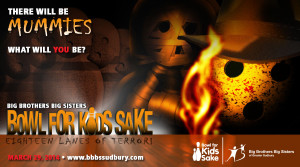
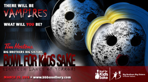
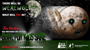
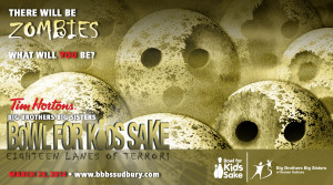
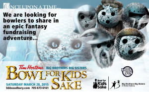
And then there’s the online component. Originally I was giving them one singular graphic to post on their social media channels, but I realized that there was a ton of opportunity here to open it up. Of course, they posted the poster again, but then I supplied them with these:
None of them are a slavish reproduction of the original poster. Each character pulled from the main poster and given its own treatment (the “Frankenball” never got done, but I did deliver a werewolf in its place). Like the printed material, each clearly belongs to the campaign, and each one clearly belongs with the other three, but at the same time, they’ve all got their own vibe.
Plus, they pose a question to the audience – “What will you be?”
Should note: I’m a fan of recycling, and when you’ve created close to two dozen of these Bowl For Kids Sake themes, you end up with a lot of material you can re-use. The adventurer with the torch and mummies in the background was taken from another theme I created. The werewolf was actually adapted from a “Red Riding Hood and the Wolf” theme I’d created. The zomballs, well, they were themselves recycled and jammed together with the original Monster Mash theme).
The Sudbury BBBS kept these circulated in the months leading up to the fundraiser, and they did a great job of keeping interest and awareness high. Certainly you don’t dump them all on the market at once. You open with the main, post that a couple times to get people aware of the campaign in general on some level, and then a couple weeks later, you post the first variation. And a week later, the next. And a week later, the next…
I was quite proud of this campaign, and the “What will you be” webgraphics ended up forming the basis for what I would deliver to every Big Brothers Big Sisters agency that used my themes afterwards.
Now, little confession here… I went totally overboard on the Epic Fantasy theme for Greater Sudbury. This one was pretty close to my own heart (grew up a big Tolkien and D&D fan) and I had a ton of ideas for extra social graphics. Some, like the “Bowling Is Coming“, were riffing off the upcoming Game Of Thrones season. Others, like the “We’re looking for bowlers to share in an epic fantasy fundraising adventure“, were tweaked from the first Hobbit movie, the third movie having just hit theaters a few months prior.
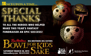
As a closing comment… when it comes to fundraising efforts, it’s always good to thank the community at the end of the campaign. In the past I urged Sudbury’s BBBS to run a low-cost ad for it, but now that social media is so ubiquitous, you can easily do it for free. It’s a nice gesture, and it can go a long way to leave the community with an appreciated feeling, which can only help the next time you ask them for support…
